In this final task I decided to continue on the theme that I had used in the ‘UPDOWNALLAROUND’ project as this gave me further ideas to explore. I decided to continue working with slightly mundane household objects and utensils. I wanted to take them away from their day to day purpose and present them differently to how we would normally view them, and even wonder initially what they are. I endeavoured to make them more interesting and even dramatic than they actually are. I wanted to maximise the use of light and shadow, as well as wanting to make the colours stand out. I also continued working with the canvas background as I found it useful to detach the objects from their normal reality and purpose.
Below I go through each shot, its composure, the ideas behind it and its enhancement in post production through digital processing techniques. Each shot is presented pre- and post enhancement.:-
1.


In this first shot I used the measuring spoons one more time. I placed them face down on the canvas fanned out. It was taken with 16mm setting on 10-22mm wide angled lens, aperture at f6.3 and 1/500 speed. This was taken in sunlight with slight cloud cover. This achieved a great effect with the shadows I feel together with the shiny surface of the metal. Using the canvas again helped take the spoons out of their environment and into a space of their own . I particularly like the contrast of smooth metal with the texture of the canvas, both of which are kept in focus. The light is defused and coming slightly from above and to the left of the spoons. This gives very slight shadow to the right and below the spoons and their handles. Hopefully one takes a moment realise what one is looking at, separated from their normal environment. I then wanted to brighten the shot and make the spoons stand out more.
The shot was then enhanced via Adobe Bridge and Camera Raw. In the Basic level of Camera Raw I increased Exposure very slightly to +0.7 and the contrast to +36. This very quickly brightened the photo and helped the spoons stand out more. Continuing this theme I increased the white slider slightly for brightness and reduced the highlights and blacks marginally. And finally on Basic I increased vibrance to +37. Moving onto Detail and sharpening I set radius at 1.2 and detail at 30, and then used amount at 66. Finally in split-toning I set shadows hue at 194 and saturation at 18. This all hopefully added detail, contrast and little cold blue to the image.
2.


This is the first of 3 shots of a green liquor glass. I haven’t added a shot of the glass upright but the idea here was to look at the glass in a different way to normal and hopefully make an interesting shot emphasising light, vibrant colour, contrast and shadow. The glass is positioned obliquely both to the sunlight and the viewer allowing a complete view of the glass and its shadow. The shot was again taken using natural sunlight on a bright sunny day. This generated a very clear shadow and the nature of the glass gives an almost textured shadow. Once again the canvas helps maximise contrast. This was shot using 100mm lens, f11 and 1/500 speed. This hopefully kept the green bowl in focus whilst allowing the stem at base to fade/blur a little. This is clearly a glass on its side, but hopefully causes the viewer to pause a little in establishing that and the white background adds to its detachment.
In Camera Raw I once again increased exposure a little to +0.40, contrast to +42 and whites to +31 , as well as highlights to +18. This was to brighten the shot further and create the very white background. I then moved vibrance to +30 to bring the colour out more. In detail/sharpening I set radius at 1.3 and detail at 24 with amount at 48. This further enhanced the clarity of the glass and its shadow. Finally in split-toning in shadows, I set hue at 122 and saturation at 25. This further enhanced the green of the glass and its shadow without becoming too surreal.
3.


In this shot it is obviously the same subject shot in the same circumstances. This time the glass is positioned where we look into the top of glass lying on its side. The sun is behind the glass and so the shadow comes towards us. The f11 aperture allows to see all of the green bowl of the glass clearly but the stem and base blur a little into the background. Also we are now visually a little further away from it being just a glass any more. The textured shadow remains and varies when we look at some it through the glass.
In post production in Camera Raw I wanted to make the white as white as possible and colour as vibrant as possible. With the sun behind the subject there was less adjustment required but contrast was moved up to +47 and blacks to -35 to brighten the white and deepen the colour and shadow. In detail and sharpening I set radius at 1.4 and detail at 61 with amount at 71. I found this really accentuated the brilliant clarity of the green glass and the small starry sunlight in the depths of the bowl. In split toning I was agin adjusted the hue in shadow to 119 and saturation to 36. This made the green even more vibrant.
4.


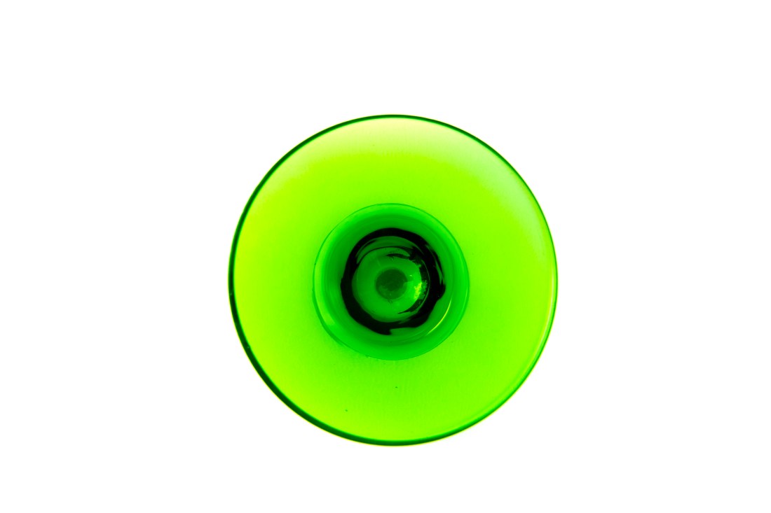
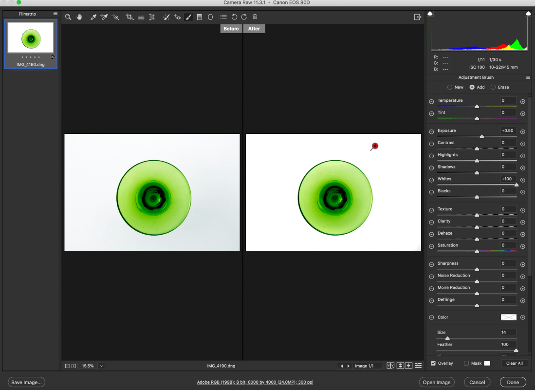
In this final shot of the glass we can no longer even recognise it as a glass. It is taken directly from above the glass and you can only guess what it is. Unfortunately, whilst taking the shot from above improved the soft shadow in the spoons shot above, it added shade in this one and made the pure white background more difficult to achieve. This was taken again with f11 aperture so that all of the visible glass is in focus but at 15mm on a 10-22mm lens. This was designed to get as close as possible to the bowl of the glass and maximise its image.
The joys of working with sunlight meant the white in this shot is not as strong as the previous two and the background became a little grey in areas. In Camera Raw basic contrast was increased to +46, whites to +38, and blacks moved to -32, in order to brighten the background and obviously increase contrast. Vibrance was increased to +29 to once again bring out the green. In split toning shadow’s hue was brought to 132 with saturation of 47 to bring the colour out further. Finally in effects I added vignetting amount to +30 with midpoint and roundness set at zero and feathering at 65. This helped take some of the darkness away from the corners of the shot. I have since found that the white background can be improved further in Camera Raw with the ‘Adjustment Brush’ tab, as can be seen below (sadly after sending them to print), and then adding a new brush I could bring more vibrance to the green:-
5.


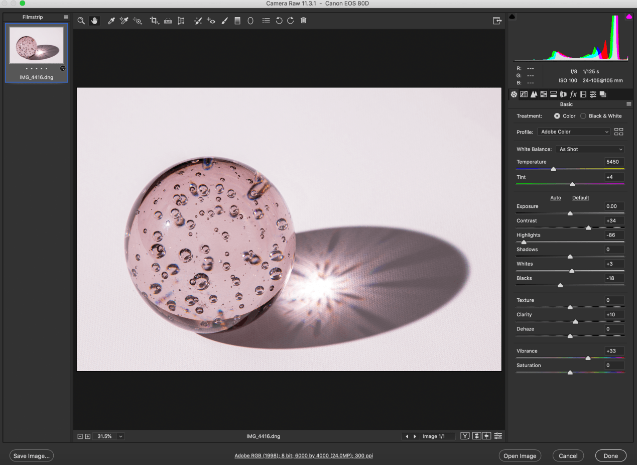
In this shot I stayed with glass as I enjoyed its clarity, transparency and shadow. In this case I used a large paperweight style ball of glass, slightly pink/magenta in colour. The glass ball has bubbles set in it which adds to its interest. This time I used a flash set on a tripod with a Hahnel transmitter and receiver remote trigger set. This allowed me to experiment with lots of angles. I finally settled on this one with the flash to the left and slightly forward of the ball. This generated this large shadow and the flash creates a starburst effect in the centre of the shadow. The bubbles in the glass generate new colours. Once again the objective was to create a slightly surreal image not immediately knowing what you are looking at, with a lot happening within the glass ball as well as in its shadow.
In post production I wanted to try to bring out the colour more and add definition to the glass and bubbles. Contrast was increased once agin to +34. I moved highlights quite dramatically to -86 and blacks to -18. This really brought out the definition of the glass ball and the shadow together with vibrance brought up to +33. In detail/sharpening I set radius at 1.3 and detail at 25 with amount at 110, again bringing out definition. And finally in split toning I set highlight hue at 315 with saturation at 8 and shadows’ hue at 317 and saturation 5. Although I wanted to bring out the colours, I could only use very little saturation here before everything became to pink, including the white canvas, so I settled for just a little.
Final 5


Printing and presentation
When printing these photographs, I chose Giclee Canson Baryta prints over C-tpye prints. This is because C-type is best used for middling colours , whilst Giclee performs best with bright bold and contrasting colours. I also chose a Baryta paper as this was most likely to give me the brightest cleanest whites which is what I needed given the background that I had used. as well as the blackest blacks. C-type prints use photographic print paper exposed to laser or LED light. Giclee uses inkjet print technologist together with pigment based archival inks. Whilst editing the shots in Camera Raw I saved the images as .dng files (digital negatives) retaining all the information of the raw file and settings. These were then saved as .tif files to send to the Printspace and as .jpg to upload onto the blog. Tiff files retain the most data for printing and preferred by the print companies, whilst jpeg files are used for the blog as they are compressed and can be compressed further, thus minimising use of memory space. I saved the files in Adobe RGB as this maximises the colour spectrum for printing whilst sRGB was primarily designed for colour images viewed on monitors.
Safe working Practices
As always with photographic projects maintaining good health and safety protocol is paramount. Simple rules must always be followed.
Oneself – always maintain and check for personal safety. Most of these shots were taken at home away from traffic, other people and hazards. Nevertheless whilst taking photos above, below etc be aware of slip, trip hazards and make your surrounding space safe.
Equipment– Camera equipment is generally expensive and often delicate and hard-edged. Protect lens with UV filter and lens caps and also return to protective covering. Sensors can get dirty and need to be cleaned professionally on occasion.
Other people and property – In this project these were not a factor, but should always be born in mind. Ask permission to photograph people in order to avoid offending them. Private property is off limits without permission to photograph. This often includes railway stations, office complexes etc.
Tripods – tripods are angular and awkward. Always be aware when using them of tripping and falling as well as hindering others.
Trip hazards – these can be numerous depending on your environment. Wires, cables, tripods again, all can cause accidents and injury. Always work in a safe space.
Computers – a lot of photography work is now done on the computer in post-production enhancement work. Working with computers has its own set of hazards. -minimise glare, protect your eyes, reduce brightness -minimise clutter- keep food and drink away -look away from the screen regularly, at least even 30mins -take a break every hour -always make sure there is adequate ventilation around you and the computer -position screen correctly- normally 20-30 degrees from vertical. -posture – there are many office injuries caused by bad posture. Your keyboards should be at elbow height, your feet flat on the floor and thighs parallel to the floor. Most office chairs and desk can be adjusted nowadays to satisfy this and avoid back, neck and wrist strains.
